Wednesday, July 7, 2010

Capitalizing on Cliches
The whole thing about a Labor Day Party is its the last weekend of summer, the last chance to make whatever you wanted to have happened that summer, happen. Last chance dance, last chance for romance. People are excited about the band, but the real attraction is to the opposite sex. Or same sex, whatever. Hot guys, cool guys, fun guys, cool girls, fun girls, sexy girls. Buzz words: hot, cool, fun, summer, love, guys, girls.

I want to use color blocking, for the girls hot pink hot orange, for the guys mint green and an icy blue. So the first three lines would have blue background big green type, next two lines (band name) would then switch to have big blue type over green background. Screen-printed look. Just giant type. Help me pick my phrases.

COOL
KIDS
WANT
RUBIX
CUBE

HOT
GIRLS
WANT
RUBIX
CUBE
(or)
SEXY
GIRLS
WANT
RUBIX
CUBE
(... sexy has 4 letters..)

COOL
GUYS
LOVE
RUBIX
CUBE

GET SOME FUN

SUMMER LOVES
RUBIX CUBE

LAST CHANCE
FOR SUMMER
FUN! LOVE,
RUBIX CUBE


Bright Ideas

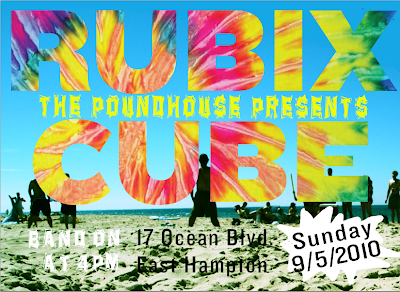
My brother told me tie-dye made him think of dirty hippies, not 80's cover bands. I'm into both, but he told me to look at Miami Vice, and think quintessential 80s. I'm really into the color blocking, the sunset colored solid t-shirts... almost a faded neon.

He also told me I was "crazy" for not capitalizing on the whole rubix cube image, since that is also the bands name (apparently spelled Rubix Kube). Either way I'm going to save this and the martini glasses he suggested as my backup plan.


Tuesday, July 6, 2010


I can't figure out how to go back in Illustrator and adjust my mask.
Its a little too Jamaican bobsled team...
I need to take out some yellow, maybe rethink all the colors.
Some cool blues or sunset colors could look cool,
especially is they are done with a paint brush vs. straight line.

Also, the beach image is almost unnecessary.
Wish I could track and kern these letters once masked, is it possible to do so?


Here's to no graphics, sorry

Font Making Attempts

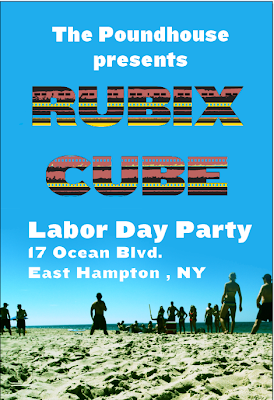
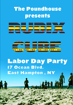
I want to make a font that is thick and black but uses graphical patterns from navajo and other textiles. This first attempt looks a little sky-like, which wasn't intentional but I'm into it. I also randomly like the way the print looks behind the text, which is the bottom example. Doesn't have much to do with my event though, which by the way is a Labor Day party with an 80's cover band.


Swipe Some Variations on
The Endless Summer

Ideas for Assignment #1 Revision

I really want to use an art nouveau like curve to connect my different pages, possibly in a poster format. I have that sort of movement in each piece and I'd like to play with it more. Sort of a romantic flow but also foreboding. My goal for my next revision is to use these ideas but create the curves and shapes out of type... or to integrate the shapes into my type. Right now I see type over shapes (ex: "Que sera, sera" page. I want to make the white curve out of type). Get it?

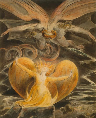
Also, any advice for my "Apple Pie" page? I wanted it to be creepy, like someone walking through a door and casting a long shadow, but it needs more work. Any good ideas? Bad ideas? Is it too cartoony? The bottom two images below are Blake and Goya, I wanted to bring some of that feeling into it.


Typography, Assignment #1


quickly separated this into two pages to get an idea.
definitely a step in the right direction. lots more work to do. need to make more time.